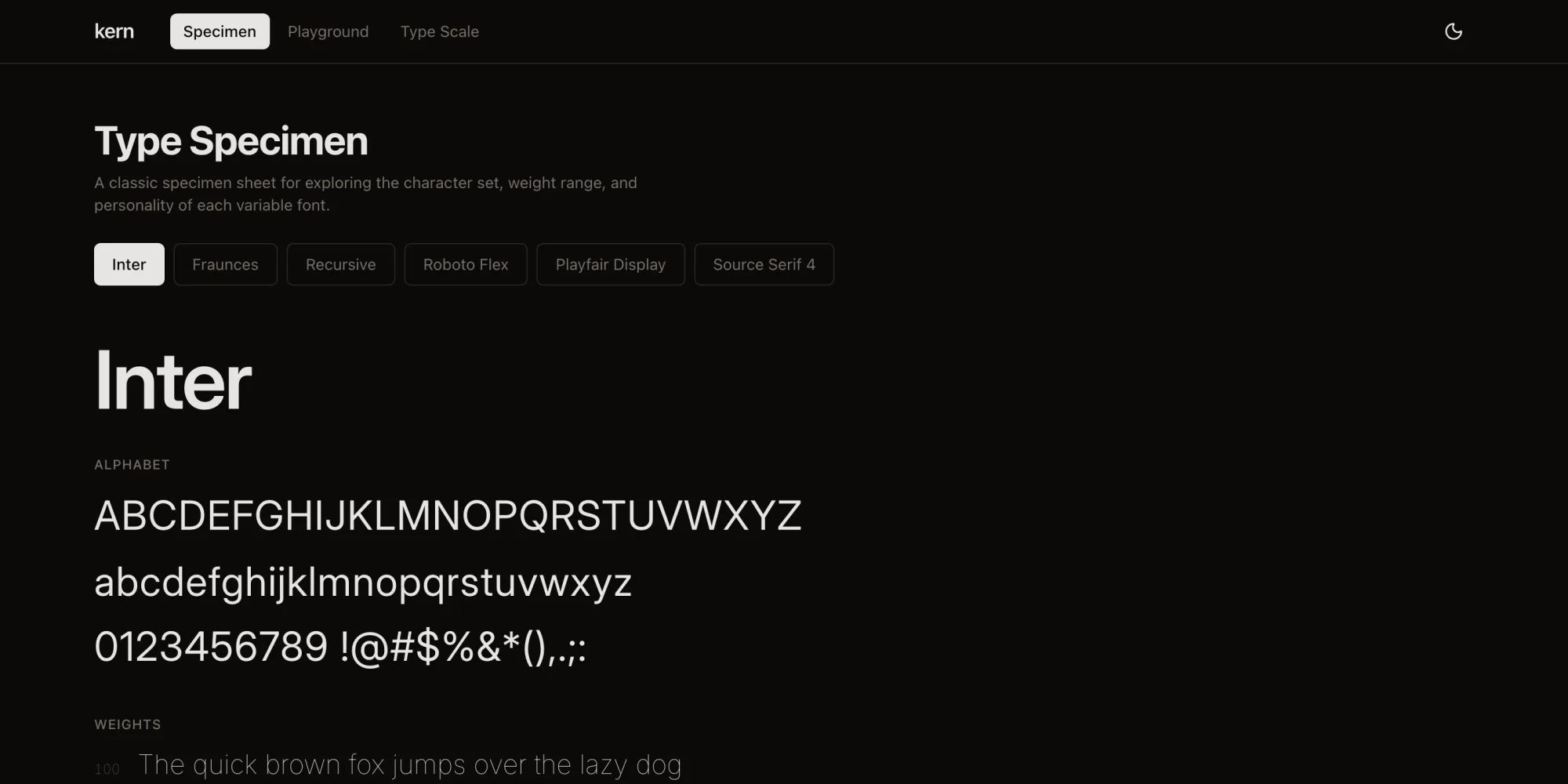
The problem
A variable font file typically encodes a continuous design space, weight, width, optical size, and custom axes, but almost none of the tools for browsing type let you feel that space. Most only let you toggle between static weights. Kern treats the axes themselves as the interface: drag a slider and the letterforms respond in real time, with spring physics standing in for the tactile feedback a physical adjustment would have. Alongside that sits a more practical need, once you've found a weight and optical size that work, turning that decision into a fluid type scale you can actually ship, using CSS clamp() rather than a fixed set of breakpoints.
Architecture
Real-time axis manipulation
Each font exposes its available axes through its own metadata, and Kern reads that metadata to build the slider set. Moving a slider writes directly to the element's font-variation-settings, and Framer Motion's spring animations smooth the transition between values, so axis changes settle into place rather than snapping.
Fluid type scale generation
The scale generator solves the other half of the workflow: turning a chosen weight and optical size into a usable set of CSS clamp() declarations. You set a base size, a scale ratio (1.25 for a major third, for instance), and the viewport range it should interpolate across, and the generator produces a full scale from caption text up to display sizes, each step expressed as a clamp() that scales smoothly instead of jumping at a breakpoint.
Side-by-side comparison
Comparison mode renders two fonts against synchronised specimen text, so changing the copy, size, or axis values on either side updates both panels at once. It's the mode built to answer a specific question, how do Inter and Fraunces compare at the same optical size.
URL state as the sharing mechanism
Every piece of configuration, the selected font, axis values, scale settings, the comparison pair, serialises into the URL's search parameters. Copying the URL and sending it to someone reproduces the exact view, which turned out to be the simplest way to make a typographic decision reviewable by someone else.
What made this hard
Loading six variable fonts on page load was the first problem to show up, and it showed up immediately: variable fonts are large, and loading all six before painting anything produced a visible flash. The fix uses next/font to self-host the fonts with font-display: swap, preloads whichever font is showing initially, and lazy-loads the rest only once they're actually selected.
The second problem was quieter but easy to get wrong: axis ranges aren't standardised across fonts. Weight might run 100 to 900 on one typeface and 300 to 700 on another. The slider system normalises the displayed range so the interaction always feels the same, while still passing the font's real values through to font-variation-settings underneath.
The third was arithmetic rather than interaction: getting clamp() values to land on exact pixel sizes at exact viewport widths means solving a linear equation for every step in the scale, and rounding at each step compounds into visible drift by the time you reach the top of a full scale. The calculator works in exact fractions internally and only rounds once, at the point where it writes the final CSS value.
Outcome
Variable fonts stop being an abstract spec and start being something you can feel: the difference between weight 420 and 450 is visible as you drag, optical sizing visibly adjusts stroke contrast at small sizes, and the scale you land on generates directly into a clamp()-based CSS scale that works from mobile through desktop. Because the whole state lives in the URL, a typographic decision made in Kern is something you can hand to someone else, not just describe to them.